2017 Website Tips to Adopt and Avoid!
How did your website rate in 2016? Did you see the conversions you were looking for, or were people bouncing off your website faster than a kid who’s just found out it’s dinner time? Read our 2017 website tips to find out how your business can better stand out in the New Year!
Things To Consider:
Long-Scroll Layouts Vs Excess Tabs
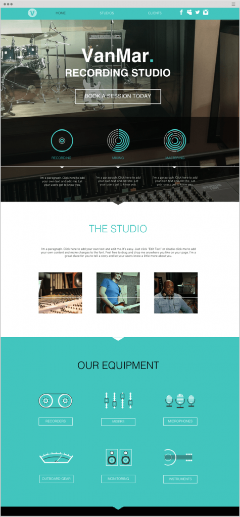
Once upon a time websites contained lots of individual pages under different tabs and links, but these days you might have noticed a distinct shift away from this. Nowadays, your average website implements long-scrolling; where businesses will list multiple sections all on the one page. For example, instead of clicking on an ‘about us’ and then ‘awards’ tab, a website might choose to put all of this information on one landing page, under multiple headings.
And it really is a simpler process – particularly for those who are scrolling on their phones. Being able to keep scrolling down to see all the relevant information for that page, as opposed to getting lost in the depths of multiple tabs, is a much more user-friendly experience.
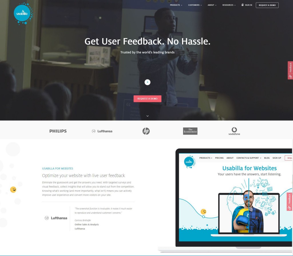
On that note, if you’re looking to test the user-friendliness of your website there are plenty of online service providers (such as those below) that can assist you with valuable feedback. Some may even provide a free trial as well! We recommend you give the following a try:
Reassure Customers with Numbers
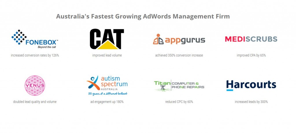
Have you won a number of awards, or helped hundreds of local customers with their product needs? Don’t be shy of boasting your achievements – these figures can persuade a potential customer that you’re not just another average Joe. Show them why they should come to you!
Video, Video, Video
Yes, video content is a big deal, and if you don’t yet know it your business is likely suffering! Just like a picture can paint a thousand words, a video is even easier on the eye of your potential customer. For example, instead of filling your site with text heavy content about your product, try adding a video at the top that clearly demonstrates how the product works, and shows it being used by a real person (even better, add a testimonial of a customer who has used your service or product).
Things to Consider Avoiding:
Homepage Carousels
Although they add an interesting visual dimension to your website, carousel designs can actually reduce your SEO rankings; as they lack content that Google can crawl (unless each image is labeled). Likewise, slow loading times for high-res images can also be enough to drive people away before they’ve clicked any further. This is not to say that you should definitely steer clear of these types of ads, but it is important to weigh up if they are the right choice for you – after all, according to a 2013 study from Erik Runyon, only 1% of people actually click on a carousel ad.
When designing your website (or having it designed for you), put yourself in the shoes of a potential customer and ask yourself:
- Is it easy to find what I’m looking for?
- Could navigation be better?
- Are there too many tabs?
- Are the colours and fonts consistent?
- Do I have too much block text on each page?
- Does my layout look dated?
With just a few questions such as these, you’ll be on your way to creating a website that is functional, user-friendly, and unique to your product. If you need a hand with getting on the right track, give our web experts a call on 1300 332 256.


